Week 2: Parking Hell
OMG, Just Pay For Parking
I see parking signs like this all over NYC and they remind me why I don’t drive – too much clutter and too much to decipher. There’s also the added anxiety of getting it wrong.
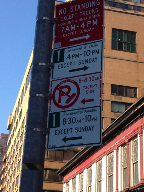
Obviously, we’re a big city with many needs, and millions of people leanring to coexist. But this sign needs work…
A Less Anxious Parking Sign
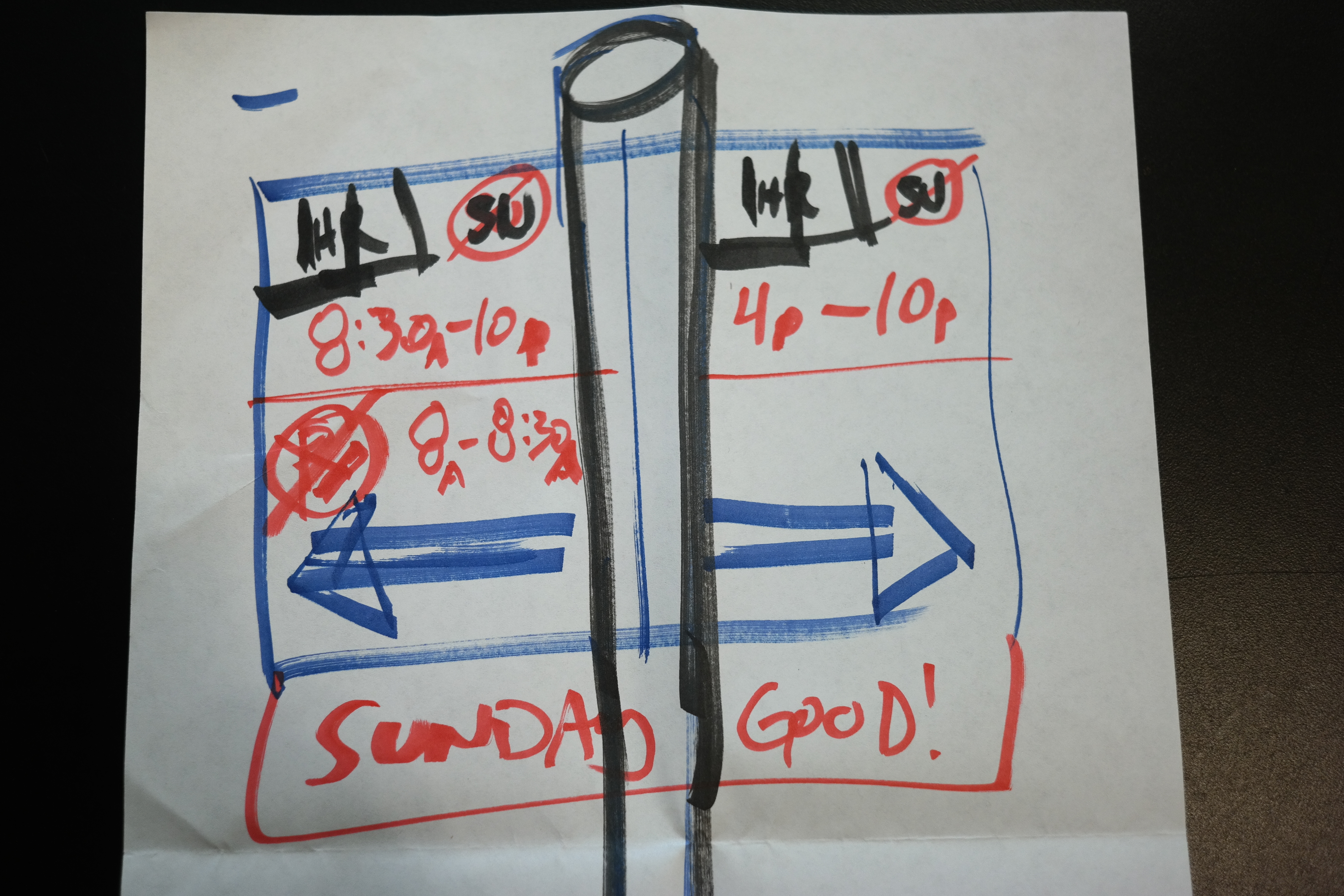
My first attempt was a bit rushed. Eager to re-organize signage hell, it immediately became obvious that half the parking rules only applied to the left side of the sign post, and the other half only applying to the right. Great, let’s start by separating that so a consumer only needs to decipher half the sign!
But shit! There’s still too much being conveyed!
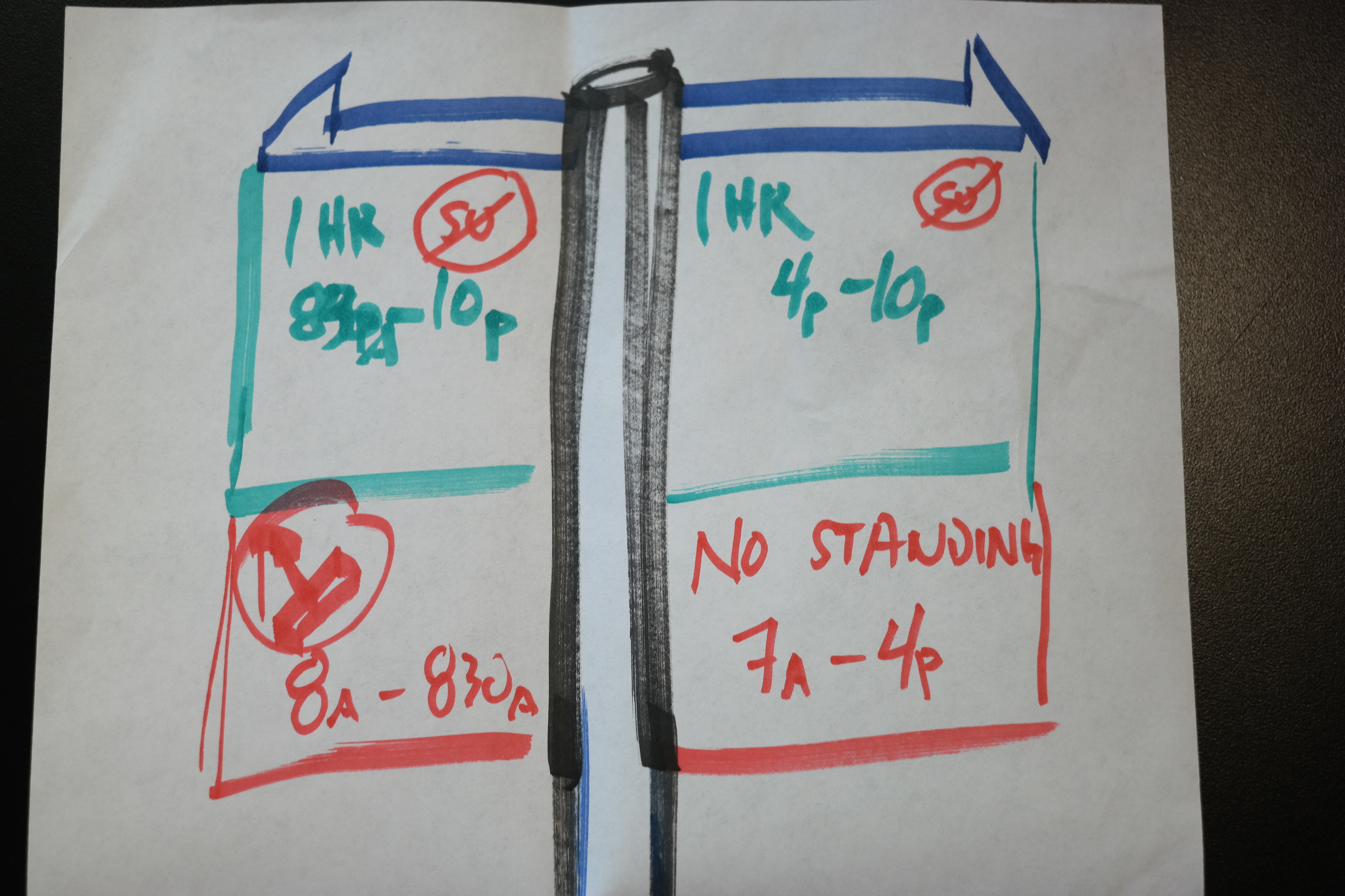
My second attempt aims to use color better – green for the important stuff, red for the exceptions, and blue for information. I also try integrate the directional arrows to be part of the signs so that we can remove it from the hours and text we’re trying to convey. Still, there’s too much information!
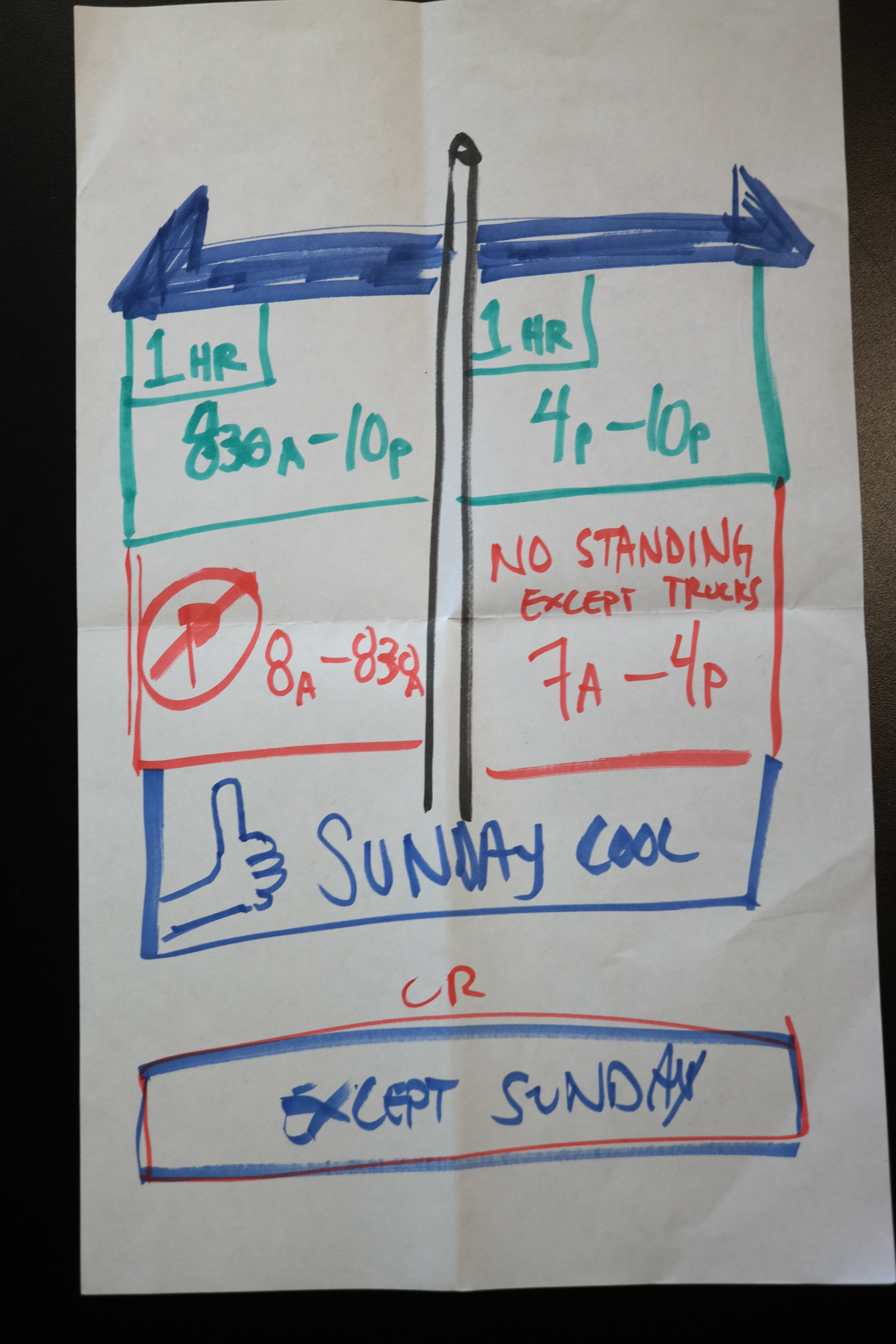
Slowing down to be a bit more methodical, I add a last info section at the bottom sign. Common with street signs are exception days, and here I move the Sunday Exception on to a line of its own. Even better, we make it span the entire sign to show that it is effective for both the left and right sides of the signpost.