Week 2: Signage
Signage in the Wild!
Good Signage!
Mighty Bowl is so good and I never realized how much of my love for it as a lunch spot is influenced by great signage.
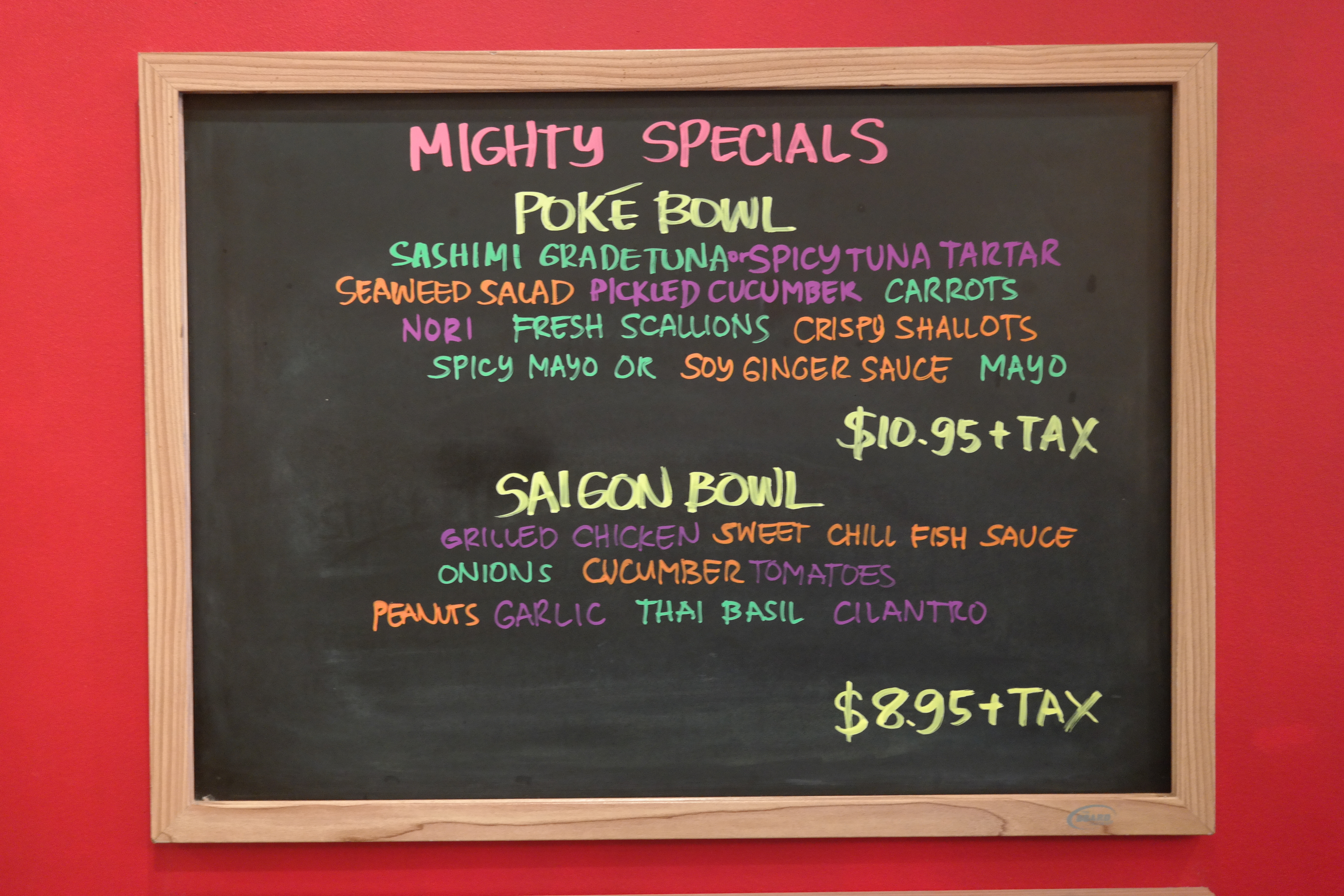
Here’s a special-of-the-week item. It really pops out, without making the common need to list ingredients boring. Clear & concise.
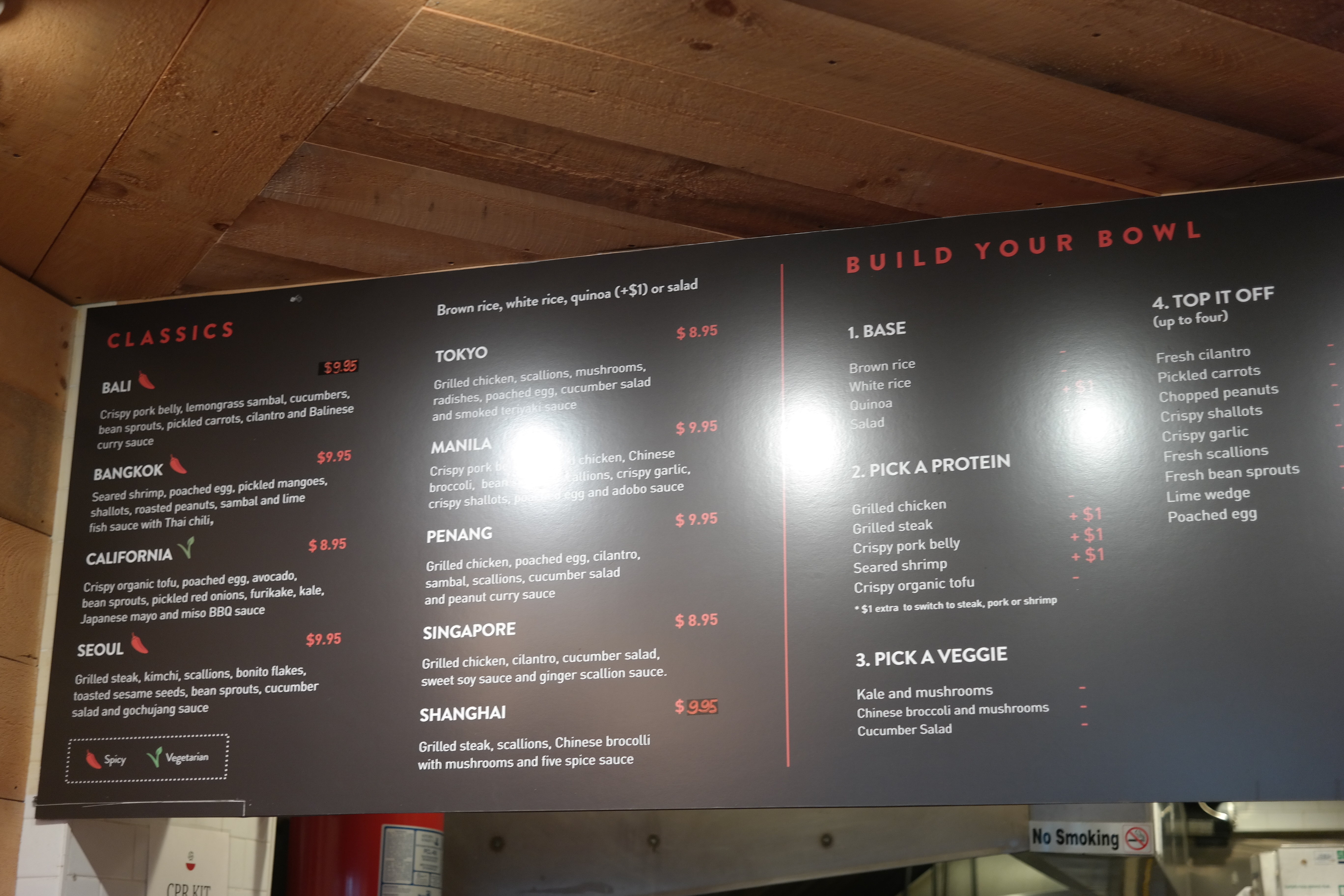
And while I normally hate anything that is build-your-own, Mighty Bowl does it the best of any restaurant I’ve been too. They keep it simple on the right for those who want to order easy, such as myself, and have a well-thought out 1-5 system for building your own bowl!
![]()
Vien is another lunch spot I love, particularly their tag line: Light. Fresh. Asian. (Part of that love stemming from those three adjectives also describing me!) But it’s great at getting the point across.
Bad Signage!
Here’s an example of lovely restaurant, terrible sign. The brown text on vertical-olive stripes really hurts my eyes and is incredibly difficult to read.
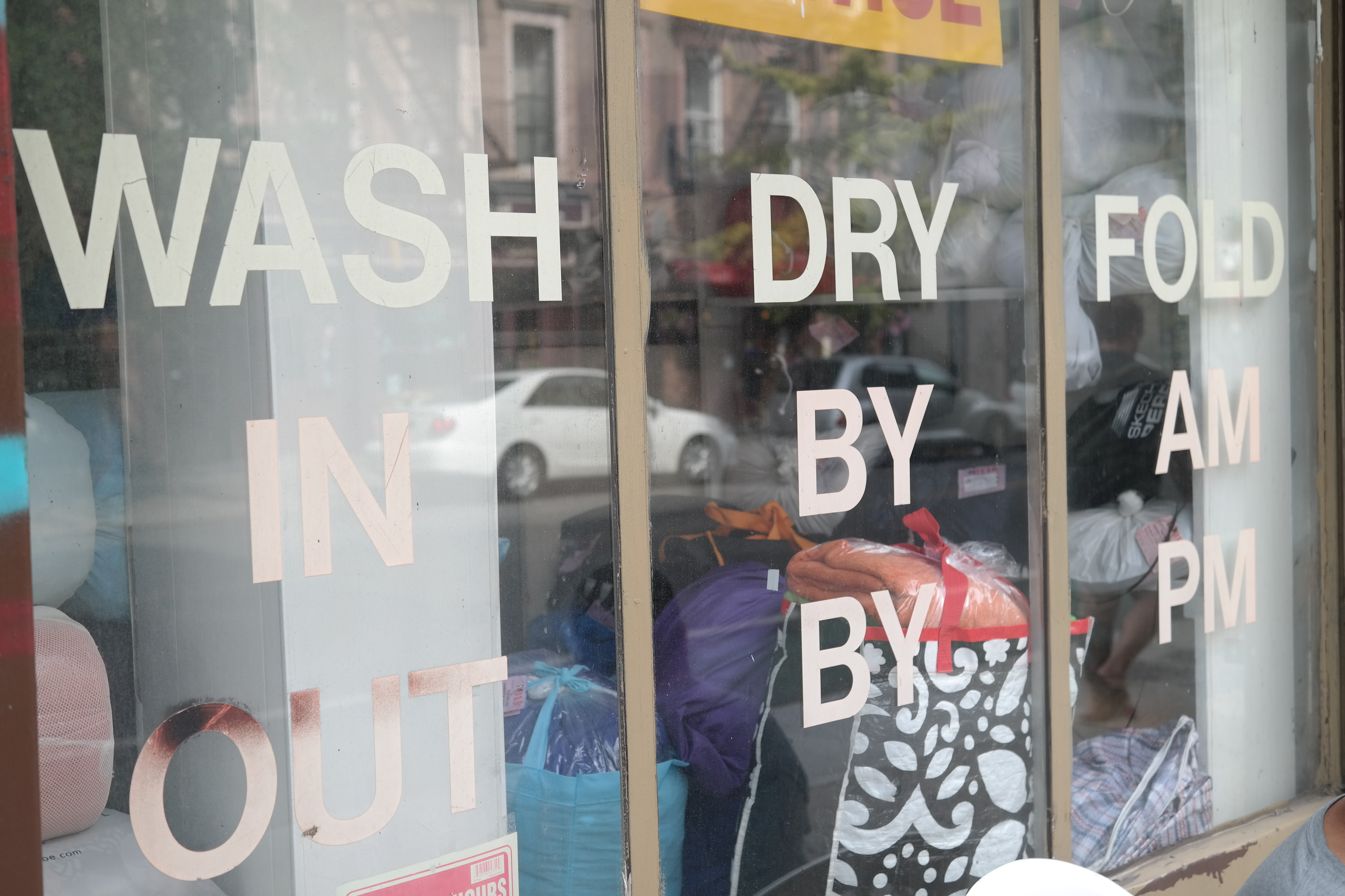
This laundromat sign really made me laugh. It’s as if the designer prioritized grid-design over readability.
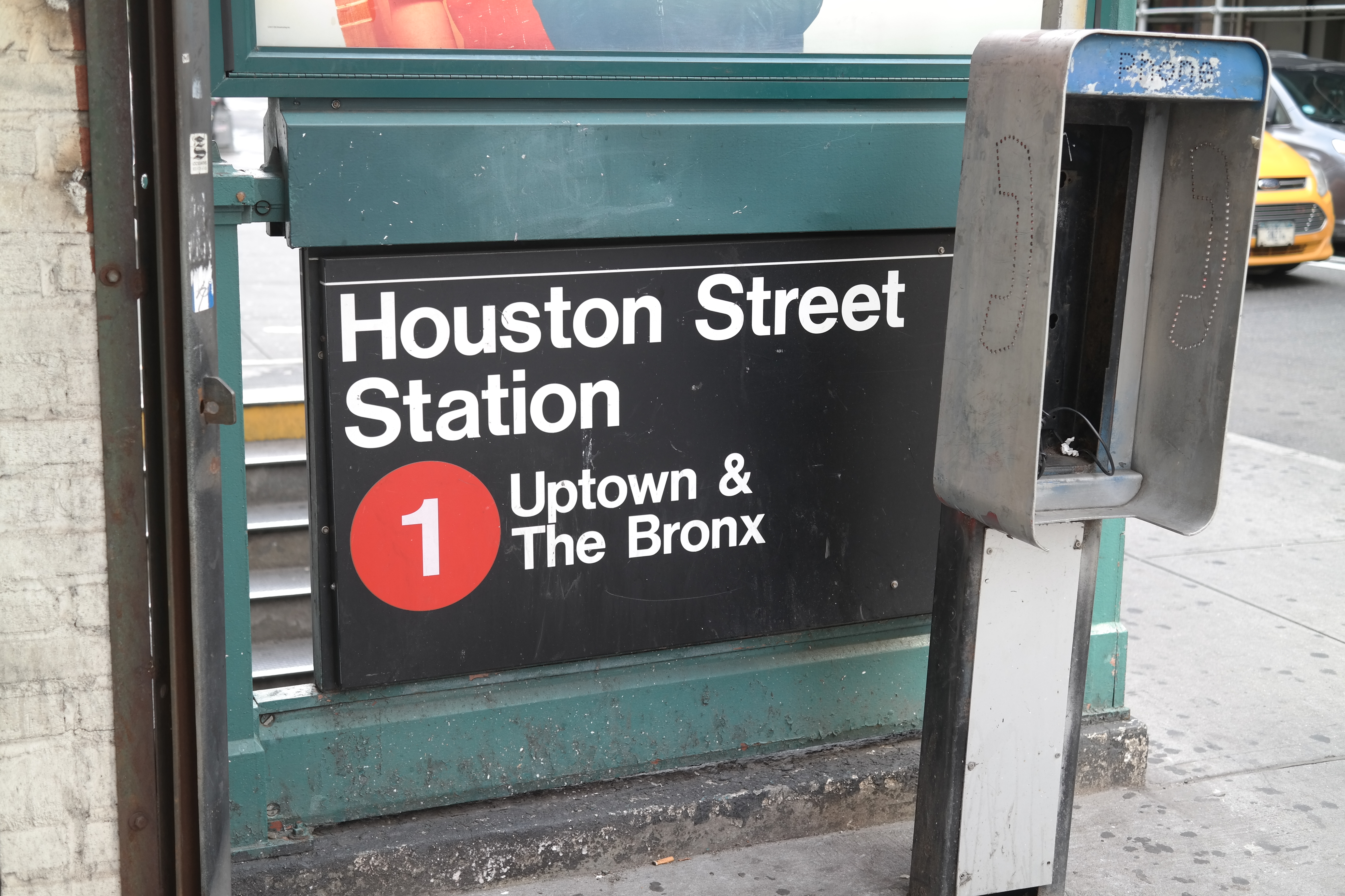
Subway signs that designate uptown / downtown have ALWAYS bothered me. It’s on the sign, but it’s not prominent enough. It seems like a missed opportunity to design signage where one can recognize which subway entrance they need to get to from further away.
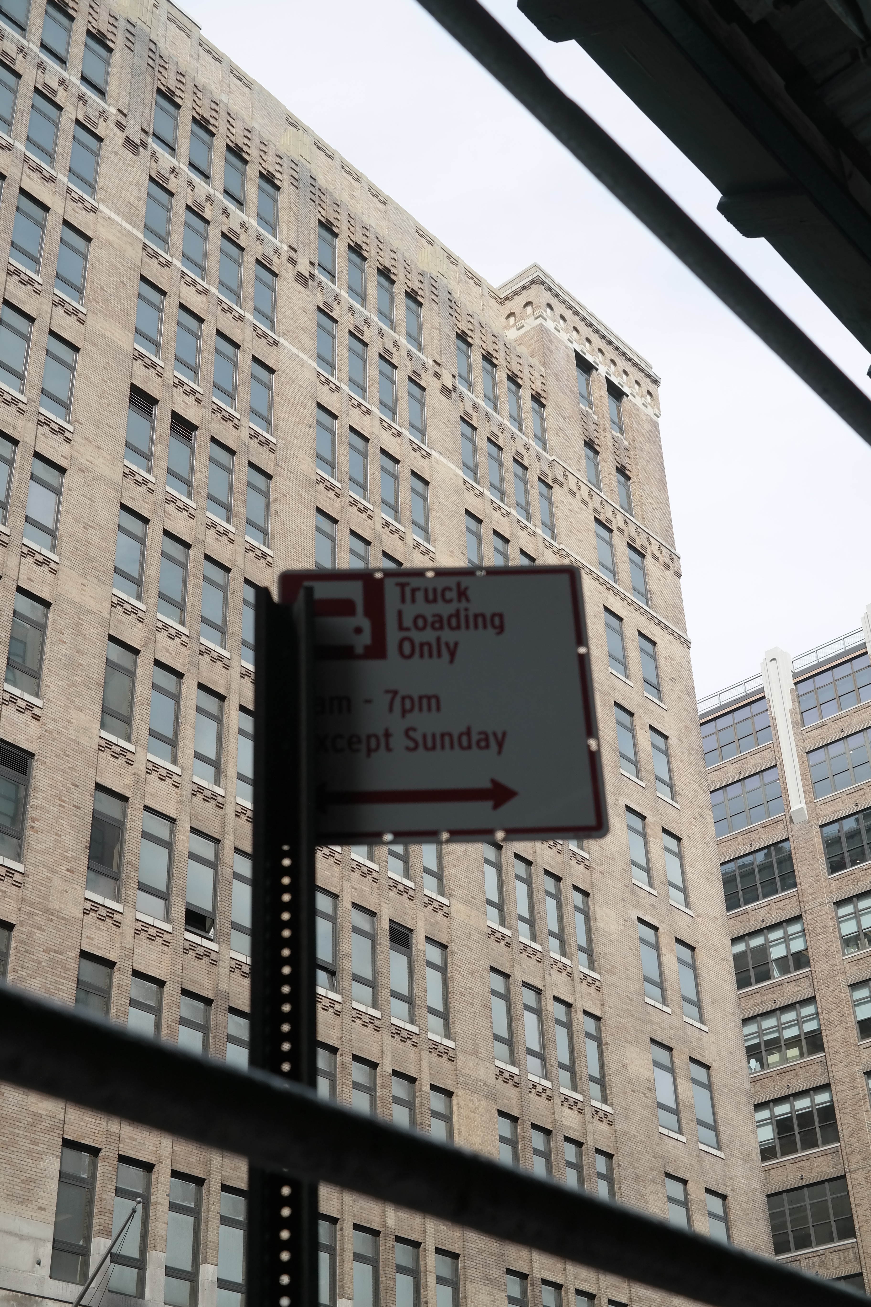
This just doesn’t belong here… It’s cut off and facing the sidewalk…